Saturday 21 December 2013

Photos To Show Change

This first photo shows how I initially wanted my double page spread (DPS) to look like. I then thought this looked too dull and needed more photos put in a better place to make use of the amount of empty space.


The second photo shows the photo I used for DPS. After using photoshop to edit her eyes, eyebrows and eliminate spots, I had to use the polygonal lasso tool to crop my model, Amy, out of the background so she could go onto a white background to go onto my magazine. I found the polygonal lasso tool much easier to use to crop Amy out of the background rather than use the quick select tool as I found this made her look very bumpy and I could not refine the edge to maker it look better and smoothen her out.  
 This third photo has just taken out the background so I could put that image immediately onto a white background.
 This is when I was editing the image. I used the quick selection tool to make her eyes look more blue and I also brightened them.

Thursday 5 December 2013

First design for the front cover of my music magazine


This is the first design I have done for my music magazine, this will not be the final one as there are adjustments I wish to do. I like how there is the main image that takes up a lot of the page because if this was on a shelf in a shop it would catch the readers eye.

Third Double Page Spread Mock Up - Music Magazine


This is the third mock up for the double page spread for my music magazine. I think the large main image on the left hand side of the page is effective because it will attract the audience if they are just skimming through the magazine. I also like the idea of 5 small images that look very similar but the model in different positions because this looks professional and is a good way to take up the page if there isn't much to write about for the article. The headline will be quite large because I think it is important for it to catch the readers eye so if they are interested in the headline they will want to read the article - the main objective.

Wednesday 4 December 2013

Second Double Page Spread Mock Up


This time I have followed the norms of the music magazines - as there is a whole page being taken up by the main images (of the popstar). This immediately draws attention in to the reader so they will be intruiged. This image will have 2 quotes on it to also get the reader interested. The article title will be large because this will also interest the reader and give them brief detail about the article.


Photos to use for music magazine

These are the images I wish to use for my music magazine, but they will obviously be photoshopped and edited before they are put on. I have chosen a model that will relate to the genre - pop due to what she is wearing and her general look.


First Mock Up Double Page Spread - Music Magazine


This is my first double page spread mock up for the music magazine I am making. I think this is an effective layout, which does not conform to the norms of my format research of music magazines, but I think this will look good once it's finished. I think having the 3 images at the top with a simple line separating the article and the images will look effective, and also having quotes will make the reader more intruiged if I put quotes that could interest them. Having 3 main images will automatically attract their attention whilst skipping through, this will make the reader want to read the article if they can relate to it or they know what's going on, which they can get a sense of by the images and quotes/article title. I will obviously keep to the branding - same font and font colours, I will also have a white background to make it look professional.

Monday 2 December 2013

Third Contents Mock Up - Music Magazine


This is my third mock up for my music magazine. This is effective because there are good spaces for images which will interest people. The layout is simplistic yet effective, I think this could work very well because there is a small area for where it says 'contents' and more area for the images and text for where the page numbers will be.


Friday 22 November 2013

Second Contents Page Mock Up - Music Magazine


For this mock up, I have made the main image the most important part of the page which will stand out the most. The actual magazine name will be spread across the page just covering some of the main image. This immediately stands out to the reader and creates a branding for them, it also looks professional and a contempory design technique. Above this will be the title 'contents' and the date of magazine issue in smaller font, so that this is less obvious but still in view for the reader. On the main image, there will be some contrasting text from the main image so that this will stand out - this text will contain the cover story articles and the page number to turn to. To the right of the main image, there will be a smaller box containing the text and page numbers, as well as this, there will be the same underneath the main image. I think it is effective to have a magazine subscription notice in a flasher in a contents page because I have seen lots of magazines have this in their contents page, this promotes the magazine and also creates professionality because it is so successful that it has many issues every year coming out that people who are interested in the magazine can buy. This information will be in a flasher because this is effective in catching the readers eye, because usually it is bright and contrasts from the branding colours so that readers immediately draw attention to it, as it is usually containing information such as competitions or magazine subscriptions where they can save money.


Thursday 14 November 2013

First Contents Page Mock Up of Music Magazine


I designed this contents page because of the simplicity and I think it will be an effective layout. There will be a main image on the page which will have a bit of text giving brief information and the page number where the article will be about. There will also be a secondary image with some text because this makes the contents page look a bit more interesting than just having the one main image and lots of text. To the right, there will be mainly text giving information about the page numbers. I will separate out all the subheadings by a strapline kind of look, a block of colour with contrasting coloured text on it to catch the readers eye, obviously using the branding colours as this is a norm in any magazine because a brand is wanting to be created and therefore recognised. I will do this because it is simple yet very effective for being recognised and is a clean, organised way of laying things out as I don't want my magazine to look too over crowded because this can lead to it looking unprofessional.


Third Mock Up of Music Magazine Front Cover


This time, on the third mock up, I designed it very differently to the normal magazines. This meant that the masthead is nearly in the middle of the page, with lots of secondary images and cover lines that stand out by contrasting from the background above the masthead. The right side will be mainly cover lines and secondary images, giving lots of information about what is inside the magazine. I will use a large flasher infront of the two main images because this catches the readers eye, as the main image would normally be the eyecatcher, so a contrasing flasher will definitely catch the readers attention. Also, there will be a barcode, issue number, and date because this shows the professionality of the magazine.


Second Mock Up of Music Magazine Front Cover


This is the second mock up of the music magazine front cover that I had to produce. This time I used techniques such as a strapline because this gives information and is at the top of the page in a font colour that contrasts from the background of the strapline to immediately draw attention to it. On this mock up, the main image will mostly be covered by cover lines. These cover lines will be different colours (but keeping it within the brand) and sizes, so that the more important information stands out to the reader. The masthead is in the normal place and there are the normalities of a barcode to show professionality and an issue number and the date.


First Mock Up of Music Magazine Front Cover


I like this mock up because it is very simplistic - which could reflect my target audience. It is not overcrowded and I used my format research to find out that most music magazines just use one main image to draw the reader in and get their attention by creating dramatic effect. The masthead is normally at the top of the page, therefore I conformed to this normality when designing the mock up. I have also put in a flasher because this is also a technique used to catch the readers attention. I will also show that this is a professional magazine by adding in a barcode and twitter/facebook icons, because this can reflect that this is a popular magazine.


Tuesday 5 November 2013

Evaluation of Music Magazine (Double Page Spread)


It would seem that most double page spreads are the same; they have a plain white (or black) background and have images and text contrasting from the plain background. This is effective because it catches the readers attention of the text, so they actually read the article. They also use one large main image that takes up one page, so when the reader turns to that page, they will immediately know who/what the article is about because of the large image that is taking up one page. On the opposite page, there will be the article about the music artist, using key graphological features such as empty space to create dramatic attention: the aim to draw the reader in. The picture will sometimes conform to the branding colours: for example, 'Q' magazine had a music artist dressed in black sat on a red and white flag, with a white background. I will use this because I think this is effective. However, I think I will have my model in front of a more interesting/colourful background because I don't want my magazine to appear too boring/plain. I will also use one of two secondary images on the page where the text is on to make it a bit more interesting. I will also use contrasting colours to make the page look more dramatic.

Some magazines do appeal to their audience, for example, Kerrang made their double page spread look very gothic by the use of colour and images, they had a black background and they contrasted this with white and red font (the branding colours). I will probably do the same but will not have a black background because I think this will make my magazine look too dark and it does not relate to the social group/audience I am trying to portray to, as the genre will be pop/modern music.

Evaluation of Music Magazine (Contents Page)


The general impression I got from the contents page were that they were quite busy but they were organised. For my contents page, I would use my branding colours to make it look professional. These branding colours can separate it out into sections and as they contrast from each other this will make the sections more interesting. The contents pages of some magazines use small images to give a brief idea to the audience of what will be in the magazine, this is ideal for teenagers as they would not want to read lots of writing, they would prefer to look at pictures to gain an understanding of what the article is about. I would also use a white background, like the front cover, because it draws attention to what is on the page. I wouldn't want to make the magazine seem too boring with a lot of white, therefore I would have to overcrowd the page a little with pictures or colour.

The contents page does not really present a particular social group. They use their branding colours but this does not represent the social groups that they are trying to portray. The only thing on the contents page that would relate to the audience/social group is any images used on the page. The font and graphological features could perhaps portray the social group/audience because the font cos relate to the informality of the magazine, however the audience cannot really be shown from the contents page. Like the contents page of most magazines, I would use one or two small images to give brief information about some of articles, because teenagers would not want to read masses of text. Overall, I would use most of the features of the contents pages on professional magazines because they set a brand and looks aesthetically pleasing for my audience.  

Monday 4 November 2013

Evaluation of Music Magazine (Front Covers)


I would take quite a lot of ideas from the front covers that I analysed. For example I would use one large main image however the main image sometimes covered the masthead. I would not make my main image cover the masthead because that technique is used when the branding is popular. As I have not created a popular brand, I would not make the main image cover a part of the masthead because that would make it difficult for the audience to read the masthead and acknowledge what the magazine is called. I would put cover lines on the magazine because that would let the audience know what would be inside the magazine. I would also choose my branding colours then use them throughout the magazine, but use them effectively on the front cover. Also, I think that a white/plain background and empty space creates the 'less is more' effect for the magazine so I would take that idea from the magazines that I have analysed. This is because it creates more attention for the main image because it will contrast from a white background, therefore standing out to the audience more. I will use techniques such as a flasher to draw attention to the reader if I'm trying to promote something, but I will not use the branding colours for this as it will make it stand out more if it contrasted and was not similar to the colours I choose for the branding.

If there was a rock band on the front dressed in black, then they would represent that the magazine could be for goths. Also, if you recognise the person on the front of the magazine then that would indicate that you could 'belong' to a certain 'social group'. For my magazine, I don't think I will create it for a certain 'group' as I will do it for general music but I don't think I will include rock bands so therefore some groups such as goths may not be interested. Therefore, my audience will be for teenagers interested in general, current music. I would attract the audience by having one main image because this seems to catch people’s eye. Also, I will have a large masthead that links to the branding colours and have a few cover lines in the colours that relate to the branding colours, and have a flasher that does not link to the branding colours; therefore this will stand out to the audience. I will have informal fonts aswell, so this will relate to the audience and how it is for teenagers who are interested in music.

Tuesday 29 October 2013

Fusion Magazine Double Page Spread Analysis


My third and final double page spread analysis. I can now see the norms of the insides of magazines so I will take all of my format research as inspiration and guidance as what is effective in producing a magazine double page spread.


Q Magazine Double Page Spread


This is my second analysis of a double page spread, so now I am starting to recognise the norms of the double page spreads which relate to how the magazine is trying to create a brand and create dramatic attention to their magazine.


Tuesday 22 October 2013

Kerrang Double Page Spread


Our next task is to analyse double page spreads for a music magazine. I used kerrang magazine first of all because it looked quite simple to analyse and it gave me a baseline idea of what is the contents of a music magazine.

Monday 14 October 2013

Tuesday 8 October 2013

NME Contents Page Analysis


This is my first music magazine contents page that I analysed - I used NME magazine.


Monday 7 October 2013

NME Magazine Analysis


This is my third analysis of a music magazine front cover. This time I used NME because I haven't used this one before and I thought it would be interesting to analysis because the front cover was very crowded and there were wuite a few techniques that I could analyse.


Thursday 3 October 2013

Rolling Stone Analysis - Music


My second analysis of a music magazine - this time I used Rolling Stone.


Wednesday 2 October 2013

First Music Magazine Analysis


As one of our coursework tasks is to create parts of a music magazine, we are now looking into analysis of music magazine front covers. I chose this front cover because many of the music magazine front covers look like this so I just chose a random one to do.


Tuesday 1 October 2013

School Magazine Front Cover Evaluation


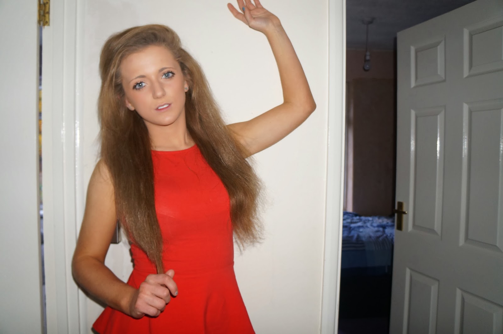
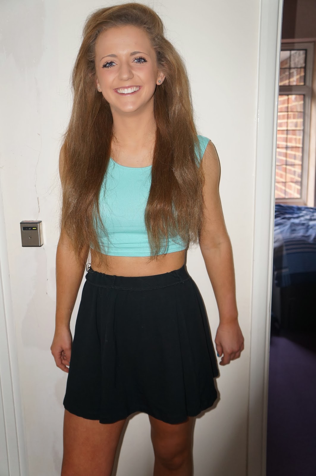
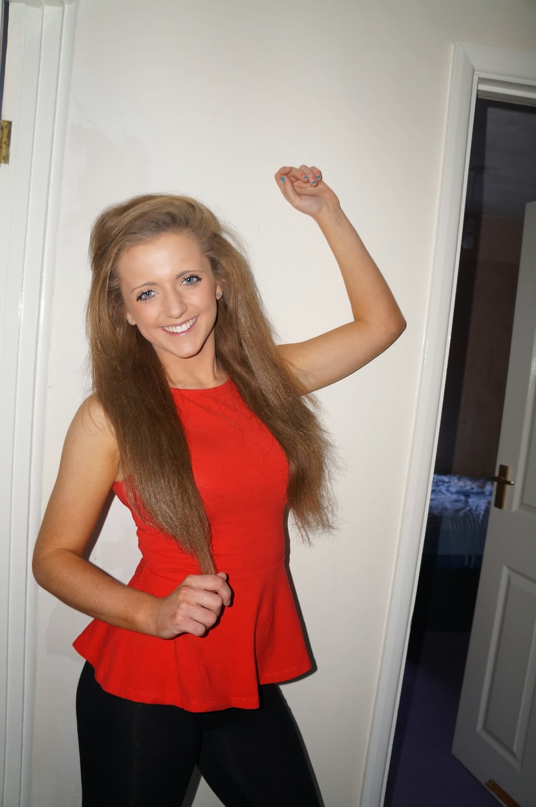
The front cover of my magazine follows all the norms that I saw when analysing. I included a flasher, strapline, cover lines, date number, issue number, barcode and a main image - therefore I do not think that my magazine is very 'basic' because I included all the elements to it. My photo that I took was of a part of the school that I thought looked quite good because it gave a nice portayal of the school. I have tried to do it as a full page image so it took up the whole page but that didnt't really work due to the time period I had to finish it. I would have ideally liked to have students posing in the main image but, again, due to time I could not do this.

To improve my magazine, I would put more time into it by doing different effects, but due to deadlines I was unable to do this. I would take a better photo that relates to the audience and I would try to understand the program we had to use a bit better, because I believe that this held me back as we only had one lesson to get to grips with it. I could have made my front cover look more professional if the deadline was more clear and the organisation was a lot better. I believe that the cover lines, strapline and flasher relate to the audience however I could have made the picture relate to the audience more but because I had no time after being told I wasn't allowed to use my first image, I was unable to get the sort of image that I wanted.  

Friday 27 September 2013

School Front Cover


This is my school magazine front cover that I made. I related it to the audience because I made it quite fun and interesting to look at. I followed the norms by having a flasher, cover lines, a strapline, a barcode and the masthead is in the normal place.


Tuesday 24 September 2013

Layout Design For School Magazine


We had to design 2 layouts for an example of our school magazine for us to practise, it also gave us a chance to practice using 'In Design'. Magazine 1 does conform to the norms of magazines because of the position of the masthead. It also has 1 main image, cover lines, date and issue number and a flasher - the usual features of a front cover of a magazine. A magazine usually doesn't have a logo which is not the norm, therefore that makes my magazine a bit different. Magazine 2 does not follow the norms of a magazine, the masthead is not at the top of the page and it doesn't have an issue number. There aren't any cover lines or a flasher however there's a strapline and several images on the front cover. I made it relevant for my audience because it made it interesting and had lots of techniques to draw attention to the reader, so these techniques can entice the audience to read it. I learnt from the research that there is a certain criteria of how a typical magazine front cover would look like. This helped me because I got an understanding of what looks good and what the norms of a magazine front cover usually are so I could include them into my magazine.


                                                                       Magazine 1:


Magazine 2:


Wednesday 18 September 2013

Wycliffe Magazine Analysis


This is my third and final analysis of a school magazine was of Wycliffe Times, this magazine wasn't very professional and you could tell the target audience. There were words that weren't spelt right but the rest of the magazine looked pretty good. It had a barcode aswell so it showed that whoever made it tried to make it look professional.


Monday 16 September 2013

SJS Magazine Front Cover Analysis


Our second task was to analyse a second school magazine front cover. This magazine looked professional so it was good to analyse but there wasn't actually much to analyse, however I managed to write quite a lot relating to audience and other features.


Friday 13 September 2013

Analysis 3 - Horse&Hound


I really enjoyed analysing Horse&Hound magazine because of the features throughout the magazine, and also, as a reader, it interests me. There are many features and techniques in the magazine to analyse so there as quite a lot to talk about and consider for the magazine I have to create.