This is my school magazine front cover that I made. I related it to the audience because I made it quite fun and interesting to look at. I followed the norms by having a flasher, cover lines, a strapline, a barcode and the masthead is in the normal place.
Friday, 27 September 2013
Tuesday, 24 September 2013
Layout Design For School Magazine
We had to design 2 layouts for an example of our school magazine for us to practise, it also gave us a chance to practice using 'In Design'. Magazine 1 does conform to the norms of magazines because of the position of the masthead. It also has 1 main image, cover lines, date and issue number and a flasher - the usual features of a front cover of a magazine. A magazine usually doesn't have a logo which is not the norm, therefore that makes my magazine a bit different. Magazine 2 does not follow the norms of a magazine, the masthead is not at the top of the page and it doesn't have an issue number. There aren't any cover lines or a flasher however there's a strapline and several images on the front cover. I made it relevant for my audience because it made it interesting and had lots of techniques to draw attention to the reader, so these techniques can entice the audience to read it. I learnt from the research that there is a certain criteria of how a typical magazine front cover would look like. This helped me because I got an understanding of what looks good and what the norms of a magazine front cover usually are so I could include them into my magazine.
Magazine 2:
Wednesday, 18 September 2013
Wycliffe Magazine Analysis
This is my third and final analysis of a school magazine was of Wycliffe Times, this magazine wasn't very professional and you could tell the target audience. There were words that weren't spelt right but the rest of the magazine looked pretty good. It had a barcode aswell so it showed that whoever made it tried to make it look professional.
Monday, 16 September 2013
SJS Magazine Front Cover Analysis
Our second task was to analyse a second school magazine front cover. This magazine looked professional so it was good to analyse but there wasn't actually much to analyse, however I managed to write quite a lot relating to audience and other features.
Friday, 13 September 2013
Analysis 3 - Horse&Hound
I really enjoyed analysing Horse&Hound magazine because of the features throughout the magazine, and also, as a reader, it interests me. There are many features and techniques in the magazine to analyse so there as quite a lot to talk about and consider for the magazine I have to create.
Analysis 2 - Sainsbury's Magazine
My second summer homework analysis of Sainsbury's magazine was good to analyse - especially the front cover. It had very vibrant colours and uses of many techniques which gave me a wide variety to look at and consider those for the magazine I'll be making.
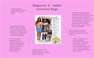
First Analysis - Hello! Magazine
For my summer homework I got set the task of analysing 3 magazines. I had to analyse the front cover, picking out the features and why they are used for the target audience. I also had to analyse the contents page and a double page spread within the magazine, saying why the techniques are used. I didn't find this magazine too difficult to analyse but I found there actually wasn't much to pick out, as there weren't a huge amount of techniques in comparison to the other magazines I analysed. So, here is my analysis of Hello! magazine, one of the three magazines I analysed.
School Magazine Front Cover Analysis - King's School
My first task was to analyse a front cover of a school magazine. I decided to choose this magazine because I thought it was the best that I could find, because the other ones weren't as professional looking.
Subscribe to:
Comments (Atom)


