My second summer homework analysis of Sainsbury's magazine was good to analyse - especially the front cover. It had very vibrant colours and uses of many techniques which gave me a wide variety to look at and consider those for the magazine I'll be making.
Friday, 13 September 2013
First Analysis - Hello! Magazine
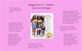
For my summer homework I got set the task of analysing 3 magazines. I had to analyse the front cover, picking out the features and why they are used for the target audience. I also had to analyse the contents page and a double page spread within the magazine, saying why the techniques are used. I didn't find this magazine too difficult to analyse but I found there actually wasn't much to pick out, as there weren't a huge amount of techniques in comparison to the other magazines I analysed. So, here is my analysis of Hello! magazine, one of the three magazines I analysed.
School Magazine Front Cover Analysis - King's School
My first task was to analyse a front cover of a school magazine. I decided to choose this magazine because I thought it was the best that I could find, because the other ones weren't as professional looking.
Subscribe to:
Posts (Atom)


