This first photo shows how I initially wanted my double page spread (DPS) to look like. I then thought this looked too dull and needed more photos put in a better place to make use of the amount of empty space.
The second photo shows the photo I used for DPS. After using photoshop to edit her eyes, eyebrows and eliminate spots, I had to use the polygonal lasso tool to crop my model, Amy, out of the background so she could go onto a white background to go onto my magazine. I found the polygonal lasso tool much easier to use to crop Amy out of the background rather than use the quick select tool as I found this made her look very bumpy and I could not refine the edge to maker it look better and smoothen her out.
This third photo has just taken out the background so I could put that image immediately onto a white background.
This is when I was editing the image. I used the quick selection tool to make her eyes look more blue and I also brightened them.
This is the first design I have done for my music magazine, this will not be the final one as there are adjustments I wish to do. I like how there is the main image that takes up a lot of the page because if this was on a shelf in a shop it would catch the readers eye.
This is the third mock up for the double page spread for my music magazine. I think the large main image on the left hand side of the page is effective because it will attract the audience if they are just skimming through the magazine. I also like the idea of 5 small images that look very similar but the model in different positions because this looks professional and is a good way to take up the page if there isn't much to write about for the article. The headline will be quite large because I think it is important for it to catch the readers eye so if they are interested in the headline they will want to read the article - the main objective.
This time I have followed the norms of the music magazines - as there is a whole page being taken up by the main images (of the popstar). This immediately draws attention in to the reader so they will be intruiged. This image will have 2 quotes on it to also get the reader interested. The article title will be large because this will also interest the reader and give them brief detail about the article.
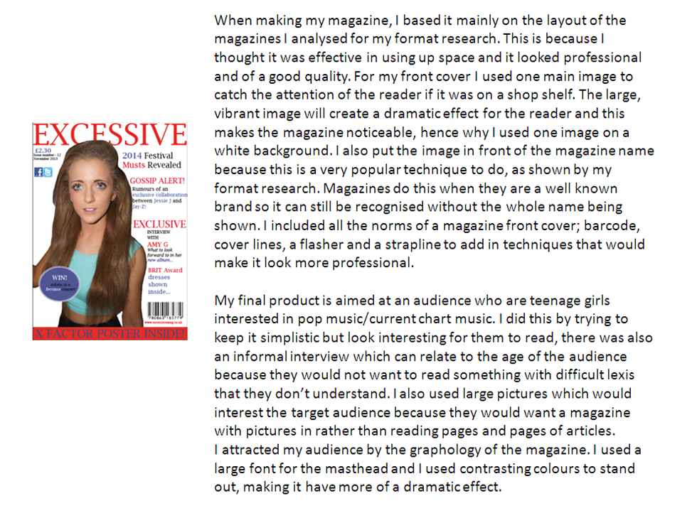
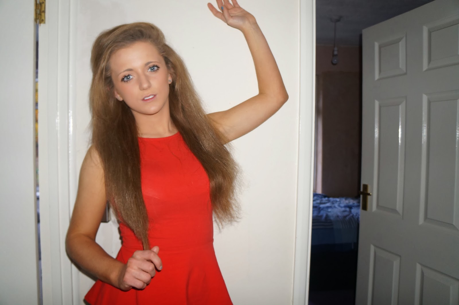
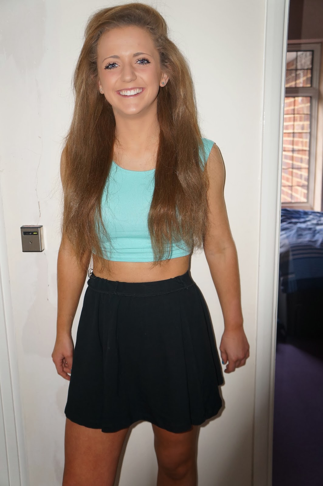
These are the images I wish to use for my music magazine, but they will obviously be photoshopped and edited before they are put on. I have chosen a model that will relate to the genre - pop due to what she is wearing and her general look.